

There're a lot of really complicated descriptions of srcset out there.
As a result, I thought srcset was more complicated than it actually is.
Here's the all-purpose srcset code I used in my static HTML. This covers 1x, 1.5x, 2x, and mobile optimization in a fine-grained way:
<img src="/images/myimage-original.png"
     alt="My Image"
     srcset="/images/myimage-100w.png 100w,
            /images/myimage-150w.png 150w,
            /images/myimage-200w.png 200w,
            /images/myimage-250w.png 250w,
            /images/myimage-320w.png 320w,
            /images/myimage-400w.png 400w,
            /images/myimage-500w.png 500w,
            /images/myimage-675w.png 675w,
            /images/myimage-850w.png 850w,
            /images/myimage-1000w.png 1000w,
            /images/myimage-1200w.png 1200w,
            /images/myimage-1400w.png 1400w,
            /images/myimage-1600w.png 1600w,
            /images/myimage-1800w.png 1800w,
            /images/myimage-2000w.png 2000w,
            /images/myimage-2200w.png 2200w,
            /images/myimage-2400w.png 2400w,"
     sizes="(min-width: 1182px) 591px,
            (min-width: 800px) 50vw,
            100vw,"
/>
Explanation
In srcset, you're telling the browser the sizes of the images that you have to fill the hole. /images/myimage-100w.png 100w, describes the width of the image myimage-100w.png as 100px.
In sizes, you're specifying the size of the image hole to fill based on media queries. When you say something like 50vw, the browser already knows the pixel width and density of the viewport, so it then figures out the specifics of what image to use.
(min-width: 1182px) 591px specifies that if the screen is wider than 1182px, the max width of my content region, the image will be at 50% of that, 591px, and no bigger.
The next entry, (min-width: 800px) 50vw, when included with the preceding, says that from 800px to 1181px the image will be sized at 50vw, or half the screen width.
Anything 799px or less will be full viewport width.
Sizes are read left to right by the browser, until a match is found, and then it uses what it found, or if no match was found, it uses the final entry that has no media query, which is the default and required.
So, I have a 2x retina display. So I scale my browser window to 800px, the image size it's looking for is half of that, 400px. Except it's got a 2x pixel density, so it's actually looking for an 800px image.
Testing
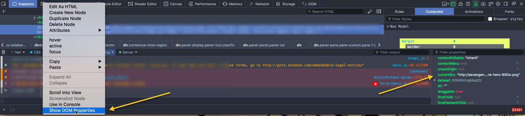
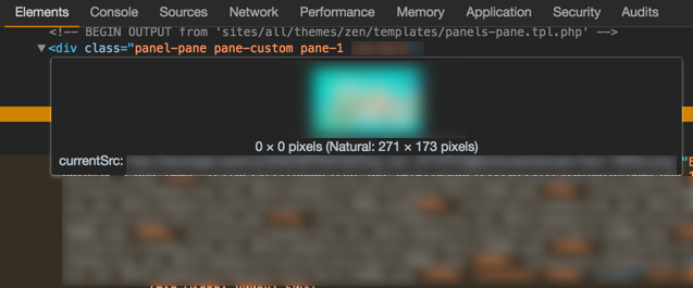
You can tell what srcset image is being rendered in Chrome, Safari, and Firefox by inspecting "DOM Properties."
Firefox:
Safari:

Chrome (just hover over image in Developer Tools):
Chrome was acting funny in the Responsive Design mode, but when I scaled the browser directly things seemed to be right.
You'll notice that I have a ton of images. It's because I'm auto-generating them. The largest will not be used in my specific use case (though it could be used in other full-width contexts), and could be eliminated, and that doesn't matter. The more options the browser has, the better. You have to find a balance between the value that comes from finessing each image and the sizes it will use, and utility to the client and website user. I'm just providing the full code.
Here's the first part in this series, the gulp build pipeline for producing images for srcset.
References:
- Which srcset image is a browser using.
- MDN on responsive images.
